
Updated on January 12, 2026
Understanding the evolving landscape of web design trends in 2026 is critical for any business looking to maintain a competitive edge in an increasingly crowded digital marketplace. The digital sphere is no longer just a place for information storage; it is a dynamic ecosystem where user expectations shift with every technological breakthrough.
By aligning your digital presence with the current pulse of innovation, you ensure that your brand remains relevant and accessible to an audience that values efficiency and authenticity. Many leading web design companies emphasize that the key to success lies in discerning between fleeting fads and foundational shifts.
Following the correct trajectory allows businesses to avoid unnecessary clutter and technical debt that often arises from chasing every minor visual gimmick. Instead, a strategic approach focuses on meaningful interactions that foster trust and streamline the path to conversion. Staying updated is not merely about aesthetics; it is about performance, inclusivity, and creating a cohesive brand story that resonates across all digital touchpoints.
Major web design trends
The current shift in the digital landscape represents a move away from passive consumption toward active collaboration. Users no longer want to simply “browse” a site; they want the site to understand their intent and respond with precision. This requires a sophisticated blend of high-end engineering and human-centric design. As we analyze the shifts occurring across the industry, it becomes clear that the focus is on reducing friction while increasing the emotional resonance of every click, scroll, and hover.
1. Agentic Web Experiences
The concept of the website as a static brochure is officially obsolete. We are entering the era of the “Agentic Web,” where the interface acts as a proactive assistant rather than a reactive display of information. These systems are powered by autonomous logic that can understand complex user goals and execute them within the browser environment.
 Intuitive Intent Recognition
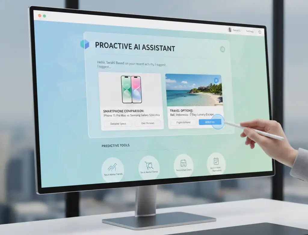 Intuitive Intent Recognition
Instead of forcing users to navigate through traditional hierarchical menus, agentic interfaces use natural language processing and behavior analysis to predict what the user is looking for. For example, if a user spends time looking at high-end camera equipment, the site may proactively offer a comparison tool or a live consultation link without the user having to search for those features.
From Information to Action
The hallmark of an agentic experience is its ability to perform tasks. In the context of a booking site, this means the platform doesn’t just show you available hotels; it can cross-reference your calendar, check airline schedules, and suggest a complete travel package based on a single prompt. This shift transforms the user journey from a multi-step search process into a streamlined conversational flow, significantly reducing the cognitive load on the visitor.
2. Bento Grid Layouts (2.0)
The modular “Bento Box” style—characterized by neat, rectangular compartments—has undergone a significant transformation. While the original version focused on static organization, the current iteration is fluid, asymmetrical, and deeply interactive. This layout style allows for a high density of information without overwhelming the viewer.
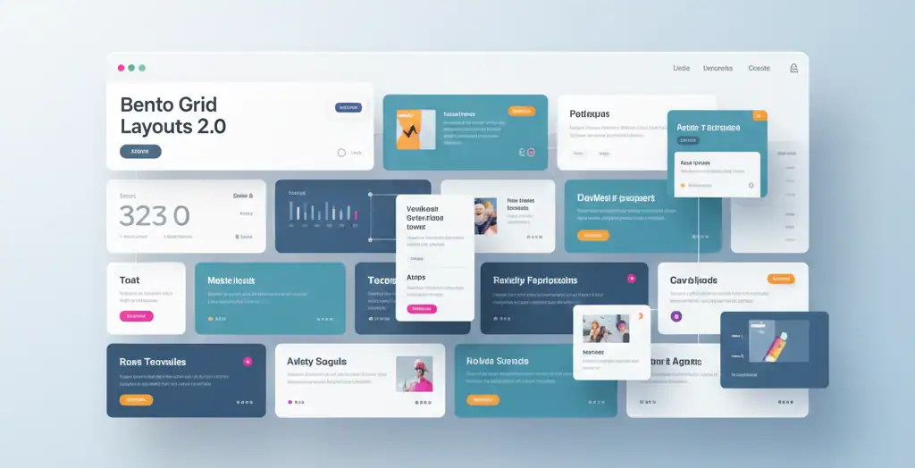
Dynamic Modular Scaling
In this updated version, the cards within the grid are not static. They can expand or contract based on user interest or real-time data updates. A financial services site might use a bento layout where the “Market Update” card grows larger during peak trading hours, while a portfolio site might have cards that flip to reveal project details upon a mouse hover.
Asymmetry and Visual Hierarchy
By breaking the rigid symmetry of early grid designs, businesses can guide the user’s eye more effectively. Larger cards naturally draw more attention, allowing designers to highlight key calls to action or primary product features while keeping secondary information easily accessible in smaller, adjacent modules. This creates a sense of organized chaos that feels modern, professional, and highly curated.
3. Kinetic Typography & Variable Fonts
Text has evolved from a medium of communication into a primary visual asset. The rise of kinetic typography means that headlines and body copy are now living elements of the design, reacting to user behavior and environmental triggers.
The Power of Variable Fonts
Technically, this trend is supported by the widespread adoption of Variable Fonts. Unlike traditional font files that require separate downloads for bold, italic, or light versions, a single variable font file contains the entire range of styles. This allows for smooth, CSS-driven transitions between weights and widths, enabling text that “breathes” as the user scrolls.
Typography as Navigation and Feedback
Kinetic text serves a functional purpose beyond aesthetics. Text that enlarges as you scroll toward it or changes color based on cursor proximity provides subtle feedback that the site is responsive to the user’s presence. This level of detail elevates the perceived quality of the brand, suggesting a high level of craftsmanship and attention to detail that mirrors the quality of the products or services offered.
4. Organic “Anti-Grid” Design
As a reaction to the highly structured, boxy layouts of the past decade, there is a growing movement toward “Anti-Grid” design. This approach embraces biomorphic shapes, fluid borders, and asymmetrical compositions that feel more natural and less like a computer-generated output. When exploring modern website design trends in 2026, this shift toward softness and flow is perhaps the most visually striking.
Biomorphism and Natural Flow
By using shapes found in nature—such as waves, leaves, and clouds—designers create a digital environment that feels less sterile. These organic shapes are often implemented using SVG masking and complex CSS clip-paths, allowing content to flow in ways that defy traditional rectangular boundaries. This is particularly effective for brands in the wellness, lifestyle, and creative sectors, where a “human” touch is essential.
Breaking the Frame
The anti-grid approach often involves elements that overlap or “break out” of their containers. This creates a sense of depth and three-dimensionality that is difficult to achieve with standard layouts. When images or text boxes overlap, it simulates the way objects interact in the real world, making the digital experience feel more grounded and less disconnected from physical reality.
5. Technical Mono (The “Builder” Aesthetic)
In direct contrast to organic designs, the “Technical Mono” trend celebrates the raw architecture of the web. Drawing inspiration from code editors, terminal windows, and engineering blueprints, this aesthetic communicates transparency and technical excellence. This is one of the more unique web designing trends currently gaining traction among B2B and technology-focused brands.
Monospaced Clarity
The use of monospaced fonts (where every character takes up the same amount of horizontal space) immediately signals a “builder” mindset. It evokes the feeling of a work-in-progress or a high-precision tool. When paired with high-contrast color palettes—often stark black and white with a single accent color like neon green or safety orange—it creates an interface that is exceptionally easy to read and navigate.
The “Under the Hood” Vibe
Technical Mono often incorporates “raw” elements like visible grid lines, pixel-art icons, and unstyled borders. This is a deliberate choice to move away from the “over-polished” look of the late 2010s. For a business, this aesthetic suggests that they are focused on substance over style, making it an excellent choice for software companies, architectural firms, and data-driven startups.
6. Tactile 3D & Glassmorphism
Advancements in browser performance and GPU acceleration have made high-fidelity 3D elements accessible for everyday web use. The current trend focuses on “tactile” 3D—objects that look like they have a physical texture and weight—and the continued evolution of glassmorphism.
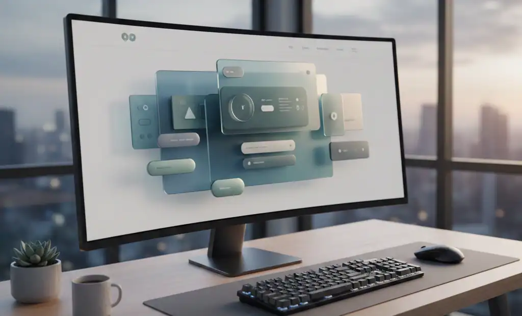
Interactive 3D Models
Websites are increasingly incorporating 3D models that users can rotate, zoom, and interact with. This is not just for show; in e-commerce, it allows customers to inspect a product from every angle, reducing the uncertainty that often leads to cart abandonment. These 3D elements are now lightweight enough to load almost instantly, thanks to optimized formats like GLB and USDZ.
Depth Through Glassmorphism
Glassmorphism involves using frosted-glass effects to create layers of depth. By blurring the background behind a semi-transparent element, designers can maintain a clean look while still showing the user that there is more content beneath. When combined with 3D elements, it creates a “tactile” interface where buttons feel like physical objects and layers feel like they are floating in a real, three-dimensional space.
7. The “Human Scribble” (Authenticity Layers)
In a world where AI can generate perfect imagery in seconds, there is a renewed value placed on imperfection. The “Human Scribble” trend involves adding hand-drawn elements—sketches, notes, arrows, and underlines—to a professional digital layout. This is one of the key website design trends in 2026 used to build immediate trust and rapport with an audience.
The Fingerprint of the Creator
Hand-drawn accents serve as a “humanity check.” They remind the visitor that behind the digital interface, there are real people with pens, paper, and ideas. A scribble around a “Sign Up” button or a hand-written testimonial adds a layer of warmth and approachability that a perfectly aligned, sterile layout simply cannot match.
Strategic Imperfection
The key to this trend is balance. It is not about making a site look messy; it is about using imperfection strategically to highlight important information. A hand-drawn arrow pointing to a checkout button feels more personal and less “salesy” than a standard blinking icon. It breaks the “uncanny valley” of perfect digital design and makes the brand feel more authentic and transparent.
8. Micro-Interactions as Feedback
Micro-interactions are the tiny animations and sensory cues that occur when a user performs a specific action. In the current landscape, these are no longer considered decorative; they are essential feedback mechanisms that guide the user through a site.
Haptic and Visual Loops
On mobile devices, micro-interactions often involve subtle haptic feedback (vibrations) when a form is submitted or an error occurs. On desktops, this manifests as visual changes—a button that “depresses” when clicked, or a heart icon that pops and changes color when a user “likes” a product. These small loops of action and reaction make the user feel in control and confirm that the system has acknowledged their input.
Reducing User Anxiety
Clear feedback through micro-interactions significantly reduces user anxiety. If a user clicks a button and nothing happens for two seconds, they may become frustrated and click again or leave the site. However, if the button transforms into a loading spinner or changes color instantly, the user knows their request is being processed. This “live” feeling is crucial for maintaining engagement during complex tasks like checkout or data entry.
9. Carbon-Conscious Design (Sustainability)
Digital sustainability has moved from a niche concern to a core design pillar. As businesses become more aware of the environmental impact of data centers and high-bandwidth web usage, they are adopting “lightweight” design strategies that prioritize efficiency.
Optimized Assets and System Fonts
Carbon-conscious design focuses on reducing the weight of every page load. This involves using system fonts that don’t require external file downloads, replacing heavy videos with optimized animations or static images, and using SVGs (Scalable Vector Graphics) which are much smaller than traditional JPEGs or PNGs.
Dark Mode and Energy Efficiency
Many sites are now defaulting to dark mode, especially on devices with OLED screens, where black pixels actually turn off and save battery life. Additionally, developers are writing cleaner, more efficient code that requires less processing power from the user’s device. For a modern business, displaying a “Carbon Footprint” badge or a “Low-Impact Mode” toggle is a powerful way to communicate corporate social responsibility directly through the user interface.
10. Hyper-Personalized Journeys
The final major shift is the move toward a “Segment of One.” Modern websites can now adapt their entire structure, content, and aesthetic based on the individual user’s past behavior, location, and preferences.
Dynamic Interface Adaptation
Imagine a website that looks different for a first-time visitor than it does for a loyal customer. A new visitor might be greeted with a high-impact video and a “Who We Are” section, while a returning user sees a streamlined dashboard with “Continue Where You Left Off” links and personalized product recommendations. This level of personalization ensures that every user gets exactly what they need without having to dig through irrelevant content.
Contextual Content Delivery
Hyper-personalization also extends to the timing and context of information delivery. Sites can now adjust their messaging based on the time of day, the local weather of the visitor, or the specific referral link they used to arrive. By creating these unique paths, businesses can increase conversion rates and foster a deeper sense of loyalty, as the user feels the brand truly understands their specific needs and circumstances.
Conclusion
The current landscape of web design trends in 2026 is defined by a sophisticated harmony between advanced technology and raw human expression. Whether it is through the implementation of agentic interfaces that act as proactive assistants or the use of “Human Scribbles” to build authentic trust, the goal remains the same: to create a digital experience that feels intuitive, efficient, and deeply personal. For businesses, staying ahead of these innovations is not just a matter of visual preference; it is a strategic necessity to ensure that your digital gateway remains a powerful tool for growth and connection in an ever-evolving world.